
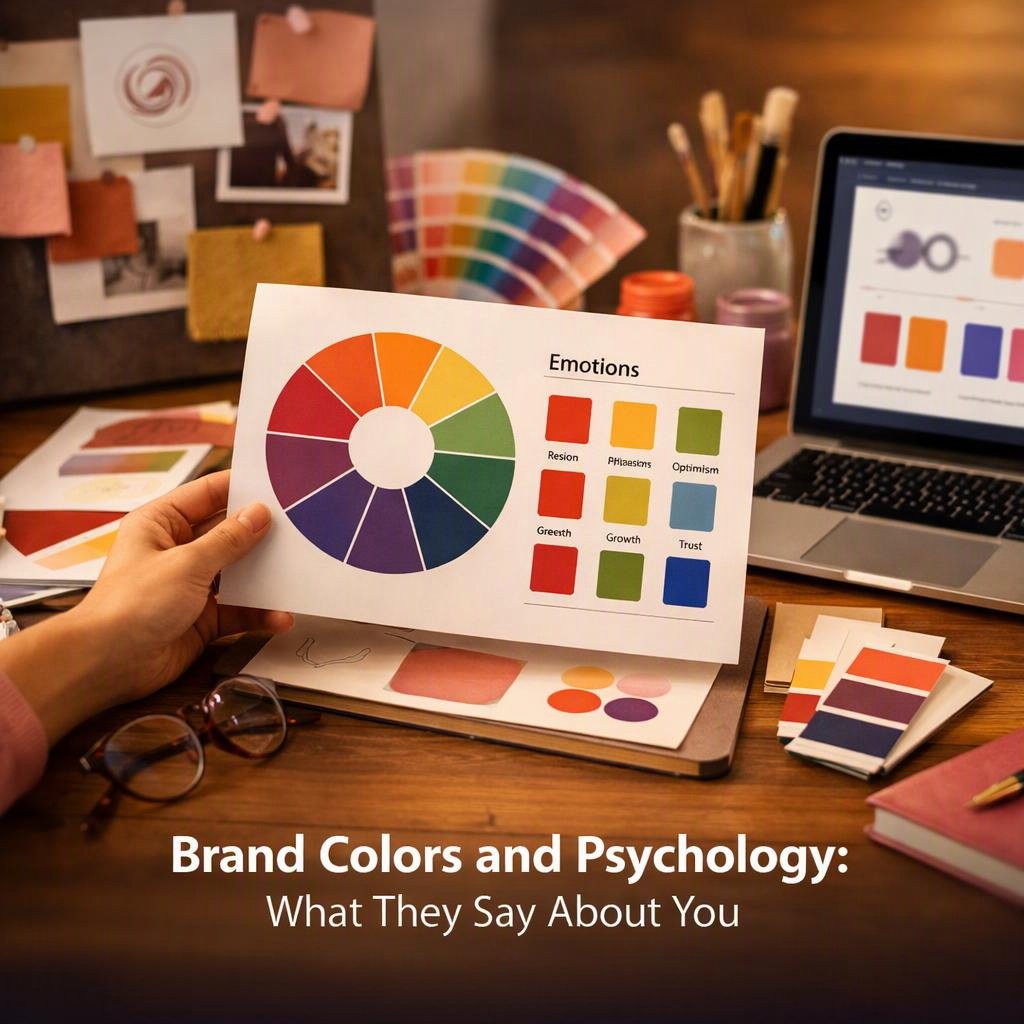
Color is one of the first things people notice about a brand, often before they read a single word. It triggers an emotional response almost instantly, shaping how someone feels about a product, service, or company within seconds of exposure. That speed makes color psychology one of the most powerful tools available in visual branding and marketing strategy.
Most businesses understand that color matters, but fewer understand why it works the way it does. The relationship between color and consumer behavior is not as simple as “blue means trust” or “red means urgency.” It is layered, contextual, and deeply tied to brand identity, cultural influences, and the overall experience a brand creates. Getting it right requires more than picking a favorite shade.
This article breaks down how color associations shape perception, what the research actually supports, and how to build a color palette that works for your specific audience and goals. Whether you are starting from scratch or refining an existing visual identity, understanding the psychological impact of color will help you make smarter, more intentional decisions.
How Brand Colors Shape Perception and Identity
Color does not exist in a vacuum. It works alongside typography, imagery, tone of voice, and brand messaging to create a complete impression. On its own, a color can suggest a mood. Combined with everything else, it communicates a brand’s entire personality.
What Color Psychology Can and Cannot Explain
Color psychology is the study of how colors affect human perception, mood, and behavior. It draws from color theory, neuroscience, and behavioral research to explain why certain hues trigger specific emotional responses. The findings are genuinely useful, but they are not universal laws.
Research consistently shows that color increases brand recognition by a significant margin. It also influences purchasing decisions, with studies suggesting that color accounts for a large portion of snap judgments made about products. These findings support the strategic use of color in logo design, packaging, and digital experiences.
However, color psychology cannot tell you that one specific color will always produce one specific result. Context, placement, saturation, and surrounding design elements all change how a color reads. A bright red on a fast food sign communicates something very different from the same red on a luxury skincare label.
| Color | Common Association | Typical Brand Use |
|---|---|---|
| Red | Energy, urgency, passion | Food, retail, entertainment |
| Blue | Trust, calm, reliability | Finance, tech, healthcare |
| Green | Growth, health, nature | Wellness, sustainability, food |
| Yellow | Optimism, warmth, clarity | Retail, children’s brands, food |
| Purple | Creativity, luxury, wisdom | Beauty, premium goods, education |
| Black | Authority, sophistication, power | Luxury, fashion, technology |
Connections Between Color, Emotion, Memory, and Brand Recognition
Color and memory are closely linked. The brain processes visual information faster than text, and color is a key part of that visual shorthand. A consistent color palette helps audiences recognize a brand instantly, even without seeing a logo or name.
This is why brand consistency matters so much. When the same colors appear across a website, packaging, social media, and advertising, they reinforce recognition over time. That repetition builds familiarity, and familiarity builds trust.
Emotional response also plays a role in how color gets stored in memory. Colors associated with positive experiences become anchored to those feelings. Over time, a brand’s color can carry emotional weight that goes far beyond its original design choice.
Why Color Works Best Alongside Brand Values, Design, and Messaging
Color is a supporting element, not a standalone strategy. Understanding what makes a brand identity genuinely stand out reveals that color is one piece of a much larger system. It amplifies values and personality, but it cannot replace them.
A brand that claims to be trustworthy but delivers poor service will not be saved by a blue logo. Color sets an expectation. The rest of the brand experience either confirms or contradicts it. When color and brand messaging align, the result is a cohesive identity that feels authentic and credible.
The most effective brands treat color as a strategic decision, not a decorative one. They choose colors that reflect their positioning, resonate with their target audience, and differentiate them within their category.
Common Color Associations and Their Strategic Uses
Understanding how specific colors tend to be perceived gives you a starting point for building a palette. These associations are not rigid rules, but they reflect patterns observed across consumer behavior research and real-world brand applications.
Red, Orange, and Yellow: Energy, Urgency, and Optimism
Red is one of the most psychologically stimulating colors. It raises heart rate, draws attention, and creates a sense of urgency. In marketing strategy, it is frequently used in calls to action, sale promotions, and food branding because it stimulates appetite and excitement.
Orange sits between red and yellow, combining energy with warmth and approachability. It is less aggressive than red but still attention-grabbing. Brands that want to feel bold and friendly without the intensity of red often choose orange as a primary or accent color.
Yellow communicates optimism, clarity, and warmth. It is the most visible color to the human eye, which makes it effective for grabbing attention. However, it can feel overwhelming in large quantities, so it often works best as an accent within a broader color palette.
Blue, Green, and Purple: Trust, Growth, and Creativity
Blue is the most commonly used color in corporate branding, and for good reason. It consistently ranks as a color associated with trust, reliability, and calm. Financial institutions, technology companies, and healthcare brands frequently use blue because it signals stability and competence.
Green carries strong associations with nature, health, and growth. It is the natural choice for sustainability brands, wellness companies, and food businesses that want to emphasize freshness. Darker greens can also communicate wealth and prestige, making them useful for premium positioning.
Purple has historically been associated with royalty, luxury, and wisdom. In modern branding, it often signals creativity, spirituality, or premium quality. It is less common than blue or green, which can make it a strong differentiator in crowded categories.
Black, White, and Neutrals: Luxury, Simplicity, and Authority
Black communicates power, sophistication, and authority. It is a staple of luxury branding because it feels premium and timeless. In logo design and packaging, black creates strong contrast and visual weight, making it highly versatile across applications.
White suggests simplicity, cleanliness, and clarity. It is widely used in minimalist branding and in industries like healthcare and technology where a clean, uncluttered aesthetic signals professionalism. White space in design is not emptiness — it is a deliberate choice that shapes how other elements are perceived.
Neutrals like gray, beige, and taupe offer flexibility and sophistication without the strong emotional charge of primary colors. They work well as background tones that allow other brand colors to stand out, and they often appear in brands targeting mature, discerning audiences.
Building a Brand Color Palette for Real Audiences
Choosing brand colors is not about personal preference. It is about understanding your audience, your category, and the specific impression you want to create. A thoughtful color palette reflects all three.
Matching Colors to Brand Personality, Industry, and Positioning
Start with your brand’s core personality. If your brand is playful and energetic, warm colors with high saturation will feel authentic. If your brand is calm and professional, cooler tones with lower saturation will align better with that identity.
Industry context matters too. Some categories have strong color conventions. Finance tends toward blue. Health and wellness leans green. Luxury often uses black, gold, or deep jewel tones. Understanding these conventions helps you decide whether to align with them for credibility or break from them for differentiation.
Positioning also shapes color choices. A budget brand and a premium brand in the same category should not look the same. Color is one of the fastest ways to signal where you sit in the market.
Accounting for Culture, Region, Age, and Personal Experience
Cultural influences on color symbolism are significant and often overlooked. White represents mourning in some Asian cultures while symbolizing purity in Western contexts. Red signals luck and prosperity in China but danger or warning in many Western markets. A global brand must account for these differences to avoid unintended associations.
Age and generational experience also shape color perception. Younger audiences may respond differently to color trends than older demographics. Personal experience adds another layer — someone who associates a particular color with a negative memory will not respond to it the way general research predicts.
This is why understanding your specific target audience matters more than following generic color psychology rules. Research your audience directly rather than relying solely on broad generalizations.
Balancing Distinctiveness With Category Expectations
There is a tension in color strategy between fitting into your category and standing out from competitors. Going too far outside category norms can confuse audiences. Blending in completely makes differentiation harder.
The goal is to find a color approach that feels appropriate for your industry while still being distinctive enough to be memorable. This might mean using a category-expected hue but in an unexpected shade, saturation, or combination. Color combinations and complementary colors can create a unique visual identity even when individual colors are familiar.
Brand identity is built through consistent, intentional choices across every touchpoint. Color is one of the most visible of those choices, which is why getting the balance right between convention and distinctiveness is worth the effort.
Testing Primary, Secondary, Accent, and Functional Colors
A complete brand color palette typically includes more than one color. Primary colors carry the most weight and appear most frequently. Secondary colors support and complement the primary palette. Accent colors add visual interest and are used sparingly for emphasis.
Functional colors serve specific purposes, such as error states, success messages, or calls to action in digital interfaces. These need to be chosen with both aesthetics and user experience in mind.
- Test your palette across light and dark backgrounds
- Check how colors reproduce in print versus digital formats
- Evaluate combinations for visual harmony and contrast
- Get feedback from real users before finalizing choices
Practical Applications, Accessibility, and Measurement
A color palette only delivers value when it is applied consistently and thoughtfully across every brand touchpoint. Execution matters as much as the initial selection.
Applying Color Consistently Across Logos, Packaging, Websites, and Campaigns
Brand consistency is what transforms a color choice into a brand asset. When the same palette appears across your logo, website, packaging, social media, and advertising, it builds recognition over time. Inconsistency, even subtle inconsistency, erodes that recognition.
Document your color choices with precise specifications. Use hex codes for digital applications, Pantone references for print, and CMYK values for offset printing. Share these specifications with every designer, agency, or vendor who works on your brand. Consistent application of your branding versus marketing materials ensures your visual identity stays cohesive across all channels.
Meeting Contrast and Color-Accessibility Requirements
Color contrast is not just a design preference — it is an accessibility requirement. Text must meet minimum contrast ratios against its background to be readable by people with visual impairments. The Web Content Accessibility Guidelines provide specific standards that digital brands should follow.
Accessibility is also good business. A significant portion of any audience has some form of color vision deficiency. Designing with accessibility in mind ensures your brand communicates effectively to the widest possible audience, not just those with perfect color vision.
- Use contrast-checking tools during the design process
- Avoid relying on color alone to convey important information
- Test designs in grayscale to check readability without color
- Consider how your palette works for users with color blindness
Using Research, User Testing, and Performance Data to Refine Choices
Color decisions should be informed by data, not just intuition. User testing can reveal how your target audience actually responds to your palette, which may differ from what color psychology theory predicts. A/B testing different color treatments on calls to action, landing pages, or packaging can generate real performance data.
Brand awareness research can also track whether your colors are becoming recognizable over time. If audiences cannot identify your brand by color alone after extended exposure, that is a signal worth investigating.
Avoiding Stereotypes, Overgeneralization, and Trend-Driven Decisions
Color trends come and go. Chasing them can make a brand feel current for a moment and dated shortly after. Brand colors should be chosen for longevity, not novelty. Color trends can inform accent choices or campaign aesthetics without dictating core palette decisions.
Overgeneralizing color symbolism is equally risky. Saying that all women prefer pink or all men prefer blue is not supported by nuanced research and can alienate large portions of your audience. Base your decisions on actual audience research, not demographic stereotypes.
The psychological impact of color is real, but it is always filtered through individual experience, cultural context, and the broader brand environment. Treat color as a powerful tool that requires careful, evidence-based application.
Conclusion
Color is one of the most immediate and emotionally resonant elements of any brand. It shapes first impressions, supports recognition, and communicates personality before a single word is read. Used strategically, it becomes a genuine competitive asset.
The key is approaching color with the same rigor you would apply to any other brand decision. Understand your audience, research your category, test your choices, and apply them consistently. Color psychology provides a useful framework, but your specific context always takes precedence over general rules.
A well-chosen, consistently applied color palette does not just make a brand look good. It makes a brand feel right to the people it is trying to reach, and that feeling is what drives recognition, trust, and long-term loyalty.
FAQ
What color is best for a brand?
There is no single best color for every brand. The right color depends on your brand personality, target audience, industry, and positioning. A color that works brilliantly for a wellness brand may feel completely wrong for a financial services company. Start with your brand values and audience research, then use color psychology as a guide rather than a rulebook.
Do brand color meanings vary across cultures?
Yes, significantly. Color symbolism is shaped by cultural context, and the same color can carry very different meanings in different regions. White, red, green, and yellow all have culturally specific associations that vary widely across global markets. Any brand operating internationally should research color meanings in each target market before finalizing a palette.
How can a business test whether its brand colors work?
Several methods are available. User testing with your target audience can reveal emotional responses and associations. A/B testing different color treatments on digital assets generates performance data. Surveys and focus groups can surface qualitative feedback. Tracking brand recognition over time shows whether your colors are building the awareness and recall you need. Combining multiple research methods gives the most reliable picture.